Thrive
Helping people have better days.
Overview
Developed by cognitive neuroscientists and built on the latest in behavioral science, Thrive platform enables highly effective knowledge sharing that directly informs and influences behavior. This platform provides actionable data that can be used to align individual knowledge and behaviors with organizational and business goals.
Scope
- Strategy
- Branding
- Product Design
- User Experience
- UI Design
- Vue.js
- Wordpress
Role
- Product Designer
- Front-End Developer
Year
- 2017 - present
Start
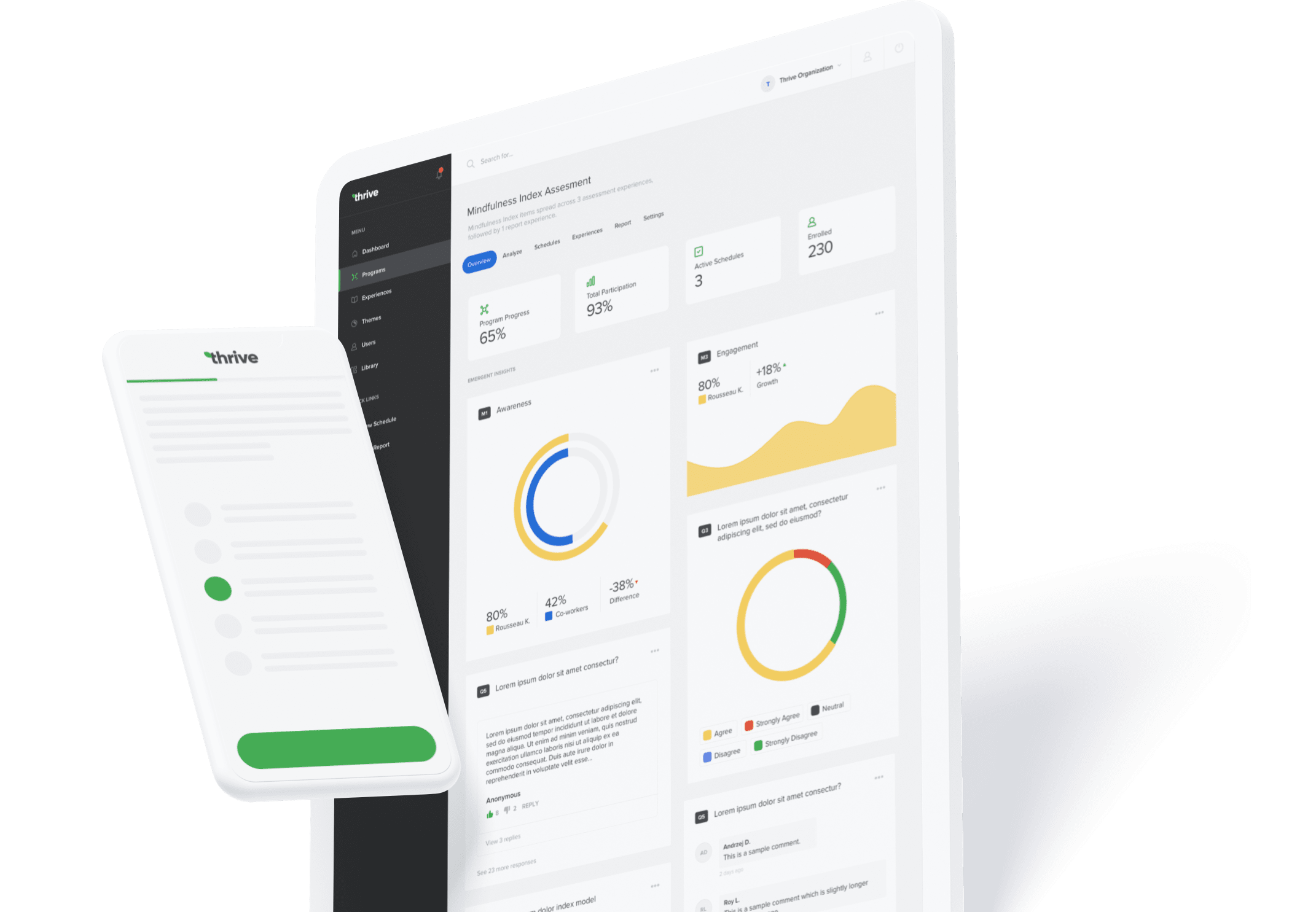
I joined the Thrive team around 2017-2018 as a product designer. Back then, Thrive was a very small team of six people — cognitive scientists, entrepreneurs and back-end developers. As a designer-developer, my mission was to help out the team on all fronts and bring this wonderful product to life. I was responsible for the design of the product and also supported the development team.
Challenge
In terms of design, Thrive lacked clear direction or structure. Company as a brand was non-existent. Their flagship product was "designed" by back-end developers using outdated Bootstrap theme. Due to the fact that the user interface was a direct reflection of the back-end logic, the user experience was pure pain. Lots of moving parts with tons of inconsistencies. I asked myself — where do I even start?
Bringing order to chaos
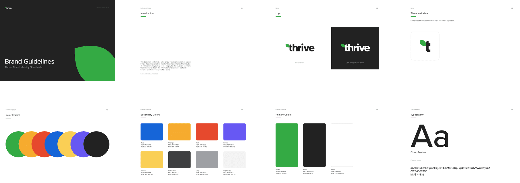
Efficiency, consistency and scale — Thrive was in much need of that. Starting from a new visual identity, I created brand guidelines and a design system which included a new color palette, typography system and other design elements used throughout the platform
My goal was to create consistent branding that will go hand in hand with the needs of the company and build confidence throughout departments and client base. Cohesive brand that will bring together all the aspects of the company and also help bring consistency across the product platform and the website.
Website
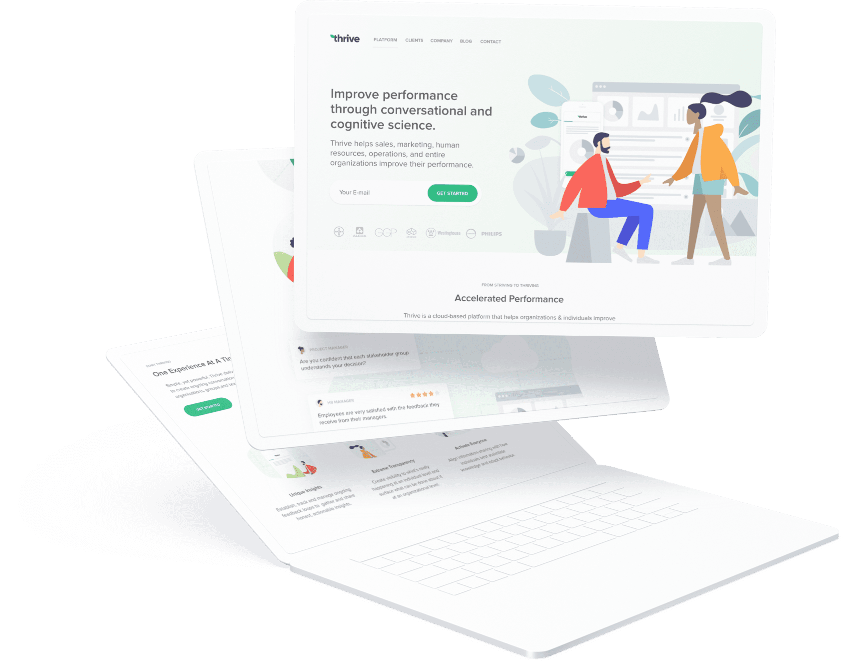
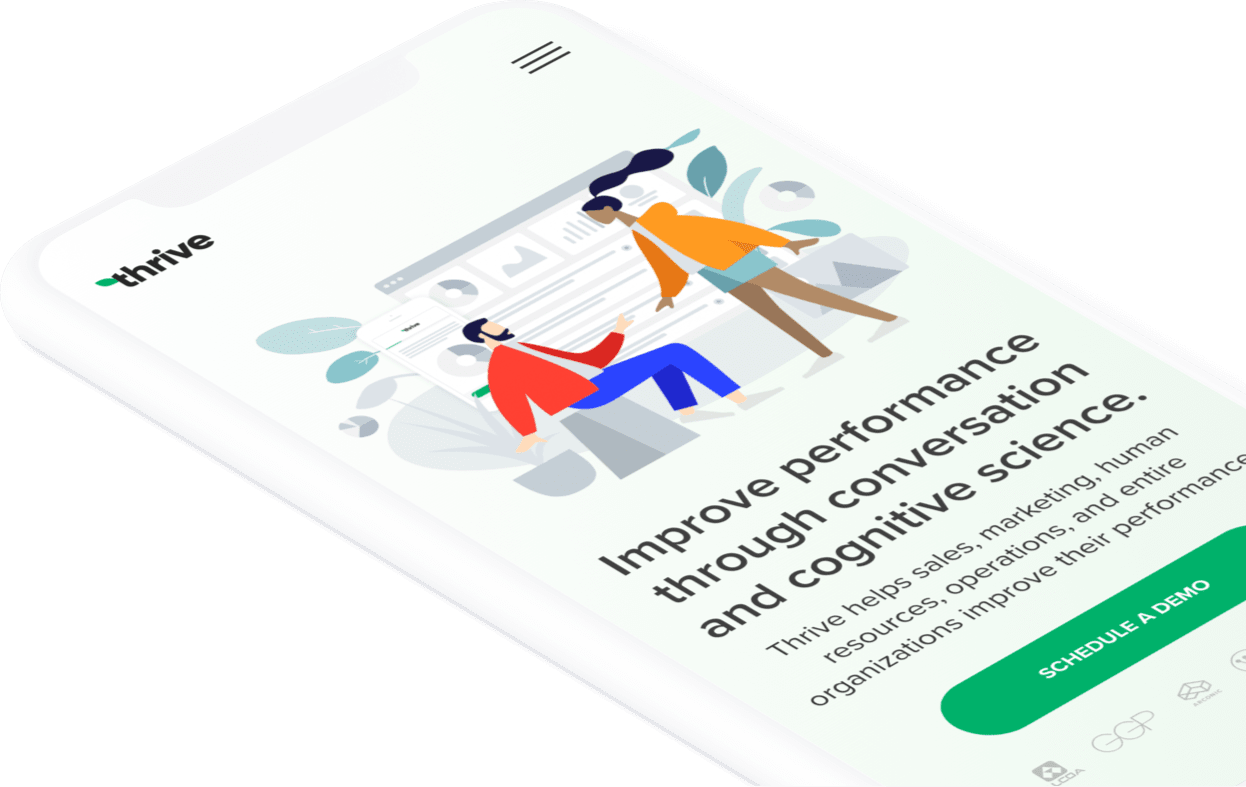
After the branding phase, we decided to move on the website redesign. After the initial research and interviews with the stakeholders, we defined some targets and business objectives. The question was simple — how do we bring more business through the website and increase the number of qualified leads?
In order to achieve that, I decided to optimize the design for conversion. I removed all design ambiguity so the user had eyes on the prize with clear navigation paths. After a couple of A/B tests, the website managed to double the conversion rate.
As a seasoned front-end and Wordpress developer, I made sure the code was performant and accessible. CMS choice was obvious — Wordpress. I developed a custom theme and leveraged ACF plugin to the maximum, so the content creation was super easy, even for the non-technical folks. The team was able to put together landing pages within minutes using different modules, all while keeping the integrity of the brand.
Platform
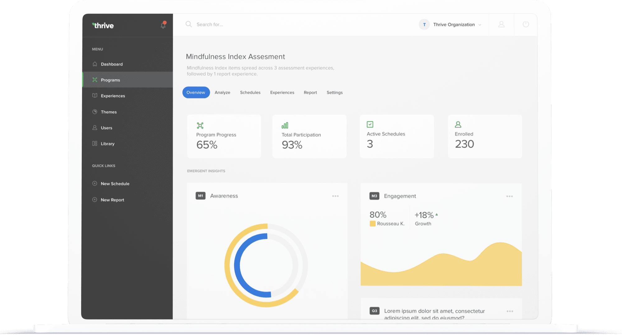
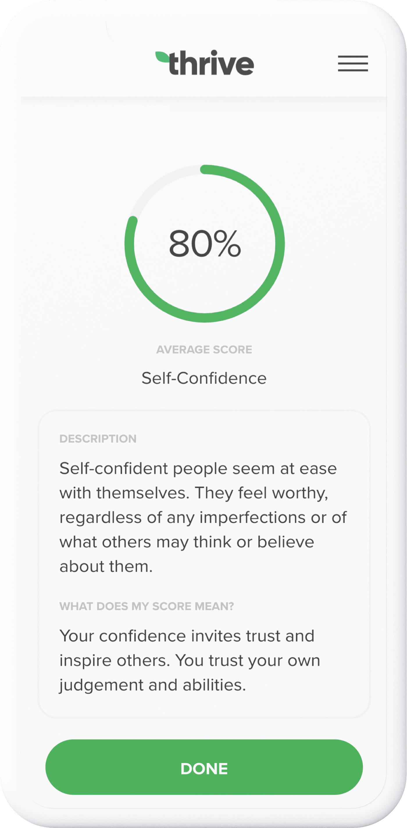
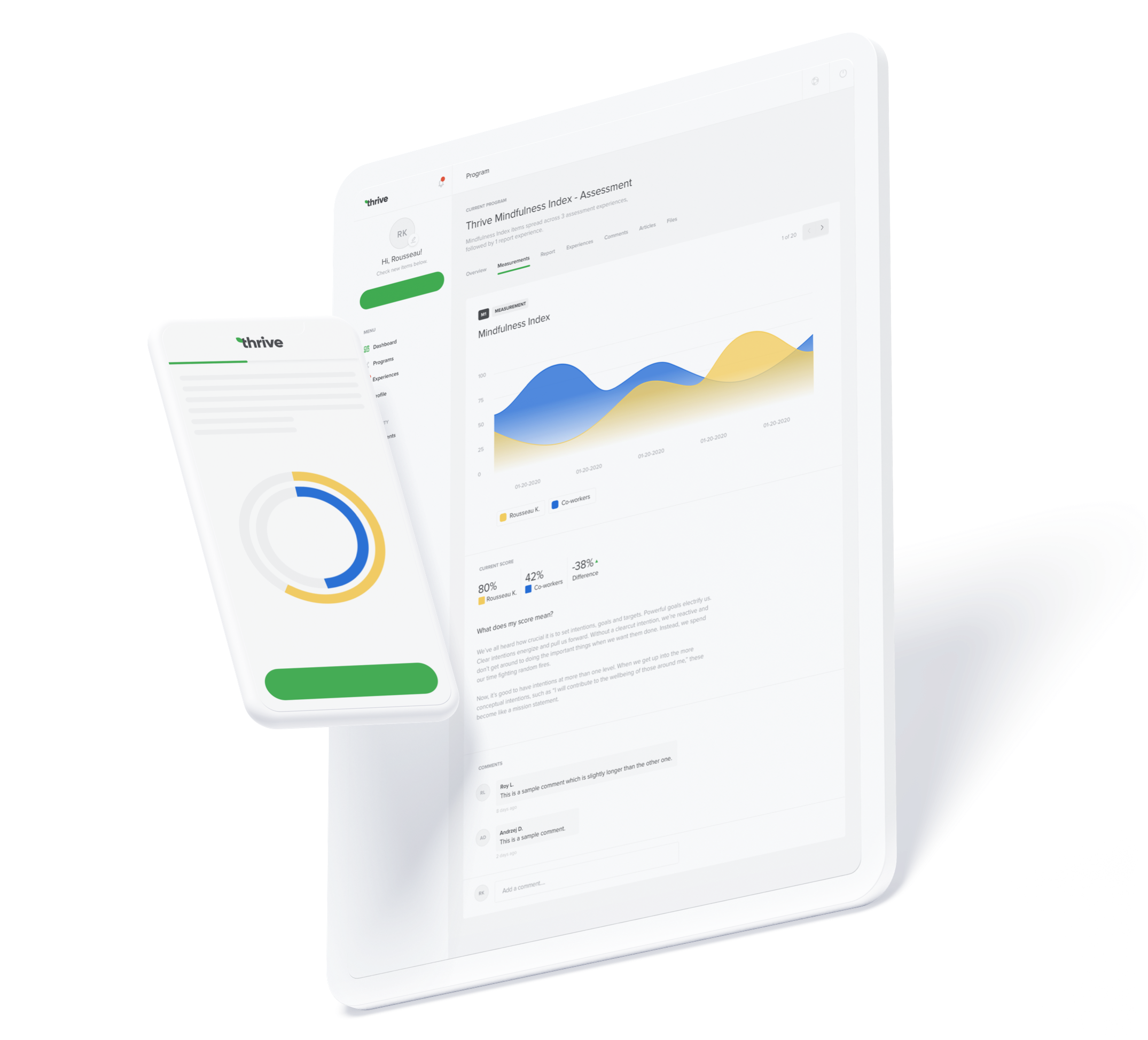
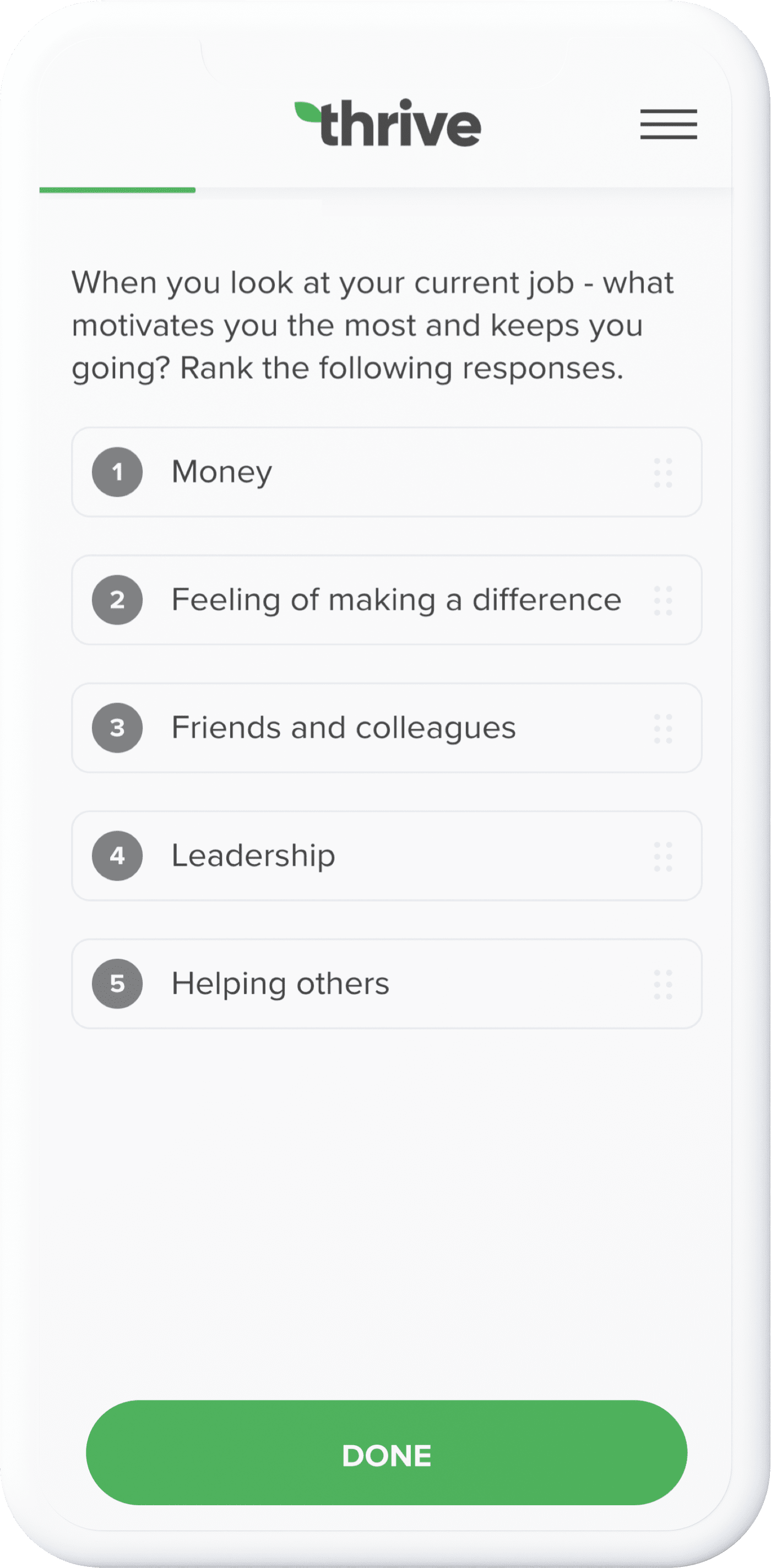
Thrive platform consists of three entities - admin dashboard, user portals and micro-experiences. The latter are bite-sized "surveys" that gather information through feedback loops and momentary assesment. Each micro-experience delivers interactive content with different question types, media, gifs, to combine into a multimedia experience.
I was responsible for redesigning these three components from the ground up. This process took circa two years with lots of iterations. As a lead designer, I tried to implement and evangelise the design thinking approach. Through extensive user research, I spent quite some time in peoples shoes trying to understand their pain points. This was a very eye-opening and humbling experience.
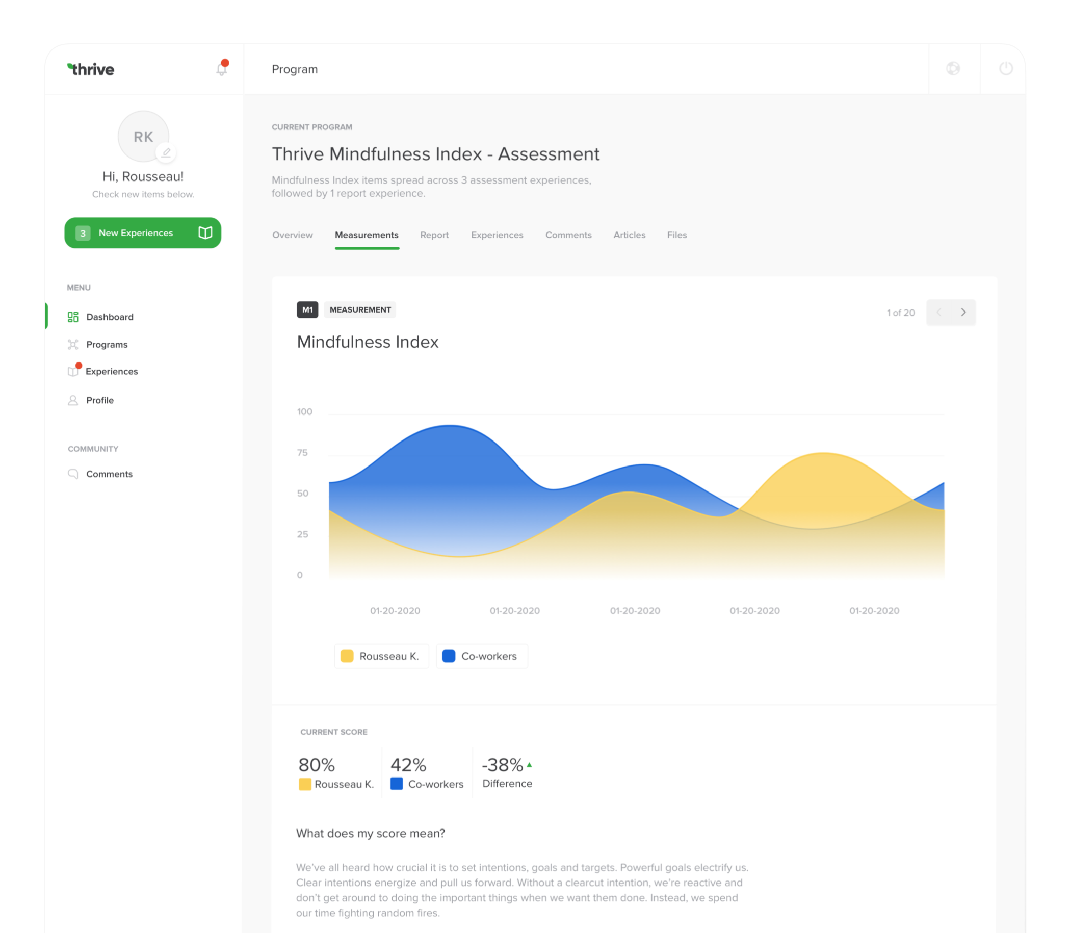
Dashboards
One of the most complex parts of this phase was to design dashboards for platform admins. I worked with large data sets to create meaningful and coherent data visualization tool. I quickly realised that dashboards have nothing in common with shiny looking mockups filled with donut charts you see on Dribbble. Through countless iterations, I realised that each design decision should influence user behaviour and each dashboard module need to provide some context for users to work with.
Quantitative should always be backed up by qualitative research and dashboards are a great way to implement this relationship. Dashboards should influence user actions through metrics people understand and can easily refer to. Also, the fact that chart libraries like chart.js or D3 have hundreds of different chart types, it does not mean you need all of them.
Development
In terms of development, I helped out the team during the implementation phase. The client-facing part of the platform was built using outdated Ember framework. We decided to rewrite it using Vue. Coming from React background, I found Vue challenging at first, but after the first week I fell in love with Vue.js. Such an elegant and clean framework to work with. Also, we managed to decrease the bundle size by almost 300% — and it worked in IE11.
Results
Without a doubt, Thrive was a very challenging project. I found myself outside my comfort zone almost in every phase of the project lifecycle. It was a great learning experience that laid a strong foundation for my future self — both as a developer and a designer. Below are some numbers that speak growth and improvement. However, these numbers or any statistical data rarely tell the whole story.
+$750k
annual revenue
1.76%
bounce rate
2.4%
conversion rate
20k
active users
300%
reduced bundle size
90/100
lighthouse score